New Look, Same Mission: Apart of Me's New Brand Identity Supporting Young People Through Grief
- Apart of Me

- Feb 6, 2025
- 5 min read
Apart of Me & Monks

Grief often leaves young people feeling "apart,"—separate from the world, their former self, or even those who might help. Yet, we also believe in the transformative power of becoming “a part” of something bigger—a supportive community where pain can transform into compassion and connection.
This belief is at the heart of our new identity, a culmination of months of collaboration, reflection, and creativity.

A Brand Identity Designed With Heart
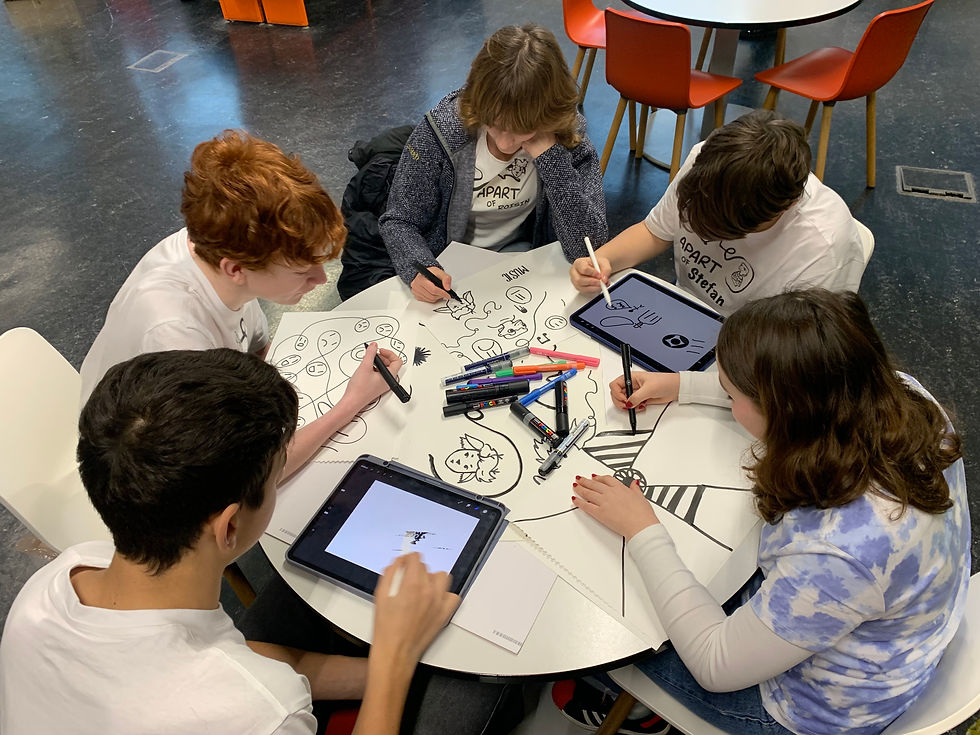
This transformation was made possible by the visionary team at .Monks. Over months of discovery and design, they partnered with Apart of Me and our community to craft an identity that is both deeply personal and universally resonant. We envisioned a brand where young people could truly feel part of its identity, able to grow and evolve—opening the door for young people to co-create and contribute at certain levels, ensuring they feel represented in the brand's very fabric.
The team behind the redesign brought not just expertise, but empathy, weaving together strategy, creativity, and design into a seamless narrative:
Caroline Lucas-Garner (Strategy)
Malin Hanås (Creative)
Emma Ridden (Copy)
Frank Gouwy and Marco Quattrocchi (Design)
Julien Roger (Producing)
From the very first conversation, the .Monks team embraced Apart of Me’s ethos of inclusion, co-design, and community, ensuring the end result reflected the authentic voices of those we serve.
A Personal Journey, A Shared Path
For many young people, grief is a journey they must navigate on their own, without a map. That’s why we exist—to transform that lonely journey into one of shared exploration and compassion.
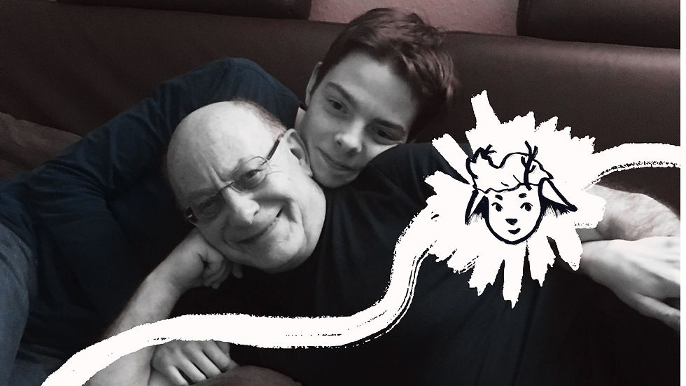
Take Henry, for example. After losing his father, he found himself grieving in a foreign land, isolated from friends and family. But as he searched for a way to make sense of his emotions, he discovered the Apart of Me game, a world where he could explore his grief safely and at his own pace.
In the vibrant digital environment of our app, Henry found companionship, perspective, and, eventually, a way to give back. His journey wasn’t just about healing; it was about helping others find their way, too. Today, Henry is one of our guides, sharing his story to help others navigate their own paths."Apart of Me was my guiding light in the dark when I felt incredibly alone, lost, and confused."

A Journey Reflected in Design
Our new identity is designed to mirror the journeys of young people like Henry. At the heart of this system is the original hand-drawn logo, a symbol of the raw, personal nature of grief. The master logo remains constant, symbolising stability and the collective spirit. But when we tell individual stories the logo transforms. “Me” becomes a handwritten signature unique to each young person. By making the logo dynamic, it transforms to reflect individual stories while connecting back to the community. Apart of Me is a community, and for a community to truly thrive, it must respect each individual’s unique path.

Surrounding these signatures are pathways, hand-drawn, organic and imperfect, reflecting the nonlinear nature of healing. They twist and turn, just like Henry’s journey—sometimes doubling back, sometimes branching into new directions. And while each pathway is unique, they all lead toward connection and growth, emphasising that no one has to walk this path alone. These paths help us connect and create a sense of belonging within the identity, giving shape to the emotional progress each young person makes.
We’ve also leaned into the concept of duality, using the contrast between “apart” and “a part” as a central theme. Our illustrations balance light and shadow, the raw and the refined, the unfinished and the complete. While our photographs offer honest, realistic portrayals, our illustrations are imaginative—offering a window into the emotional states and inner worlds of individual journeys. These hand-drawn illustrations, full of empathy, offer a deeper connection to the human experience.
This isn’t just design—it’s a visual language that mirrors the tension and hope in every young person’s grief journey.The colour palette reflects this emotional depth. Our primary colors, black and white, symbolise the duality—the tension between the inner storm and the inner light, and the transition from "before" to "after." The secondary colours, vibrant yet gentle, capture a wide spectrum of emotions. Spanning nearly the entire colour wheel, they symbolically convey that Apart of Me encompasses the entire emotional spectrum, offering a space for every feeling along the journey.
Typography also plays a vital role in conveying emotion. Our primary typeface, Fenul, is inspired by an anatomy book—it has a human touch and strong character, with enough complexity to add depth and meaning. Raleway, our secondary typeface, offers simplicity and balance, reinforcing the duality at the heart of our design.

The Cornerstones: A Design Rooted in Collaboration and Meaning
The five Cornerstones at the heart of Apart of Me’s new visual identity originated from the In This Together report—a powerful exploration of how communities can support young people through grief. Co-created with young people themselves, these principles reflect the deeply personal and collective aspects of healing (Throw Out the Rulebook, Redefine Your Story, Look Up at the Stars, Create Consistent Rituals, Be Part of Something Bigger).

When.Monks took on the challenge of reimagining our visual identity, they didn’t just draw inspiration from these Cornerstones—they brought them to life. The team carefully extracted five distinctive shapes from the logo and the negative spaces within, each retaining the hand-drawn texture that makes our logo so human and heartfelt. These shapes now form a cohesive design language used throughout the brand. They frame photography, highlight milestones, and create pathways—dynamic visuals that echo the raw, unpolished edges of real-life grief journeys. The hand-drawn texture connects every element, providing a harmonious yet subtle reminder of Apart of Me’s origins.
What’s particularly exciting is how this thoughtful design system ensures every piece feels intentional. Most users won’t consciously notice that these shapes come from the logo itself, but they’ll feel the unity and warmth it brings to the overall experience. It’s a quiet, almost hidden thread of connection—just like the unseen bonds that tie us all together in grief and healing.
This is the brilliance of Monks: weaving profound meaning into every detail. The Cornerstones aren’t just abstract principles—they’ve been transformed into tangible, living elements of our brand, grounding our community in a sense of belonging, growth, and shared purpose.

An Invitation to Belong
Henry’s story reminds us of the transformative power of community, creativity, and shared experience. His journey—from isolated grief to guiding others—is a testament to what’s possible when we move from being “apart” to becoming “a part.”
Our new identity reflects this journey, visually and emotionally. It’s not just a redesign—it’s a recommitment to our mission: to help young people feel less alone, to provide them with tools and support, and to remind them that they are always A PART of something greater.
Through our new identity, we invite you to join Henry, and the countless others like him, who are turning their pain into connection and compassion. Whether you’re here to find your own pathway or to help someone else, you belong.
This is your story. This is our story. Let’s write it together.


Comments